
Helping a UK-based climate-tech company transform high-frequency emissions data into a real-time dashboard that makes carbon footprint insights easier to understand, trust, and present to investors.
The client is a climate-tech AI company based in the United Kingdom, pioneering a new generation of carbon measurement. Their proprietary platform allows organizations to monitor emissions not only daily, but at hourly and even five-minute intervals. As the company prepared to scale and engage institutional partners, they needed a dashboard that could communicate the precision of their technology clearly to both technical and non-technical audiences.
Their internal team had deep climate science expertise, but the product needed a stronger visualization layer. Raw environmental data alone was not enough. Investors, sustainability officers, and corporate clients needed to see emissions patterns in a way that felt credible, accessible, and ready for decision-making.

The challenge was turning dense five-minute emissions data into a reliable real-time experience.
The client’s core innovation created a technical challenge: their carbon dataset updated every five minutes, producing a level of data granularity that standard dashboard tools could not handle smoothly. The system needed to visualize complex environmental metrics without slowing down, distorting trends, or overwhelming users with too much scientific detail.
At the same time, the dashboard had to serve multiple audiences. Climate scientists needed accurate model representation, business stakeholders needed clear trend visibility, and investors needed a polished interface that communicated innovation and trust.
The goal was to create a responsive, real-time carbon footprint dashboard that could accurately visualize high-frequency emissions data while positioning the platform as a credible, investor-ready climate technology product.
We built a custom visualization engine for live carbon footprint intelligence.
The solution was developed using Dash and Plotly, allowing us to create bespoke plots and data modules tailored to the client’s five-minute carbon tracking model. Instead of forcing the data into generic chart templates, the visual system was designed around the specific logic of emissions measurement, trend interpretation, and sustainability reporting.
We worked closely with the client’s climate science team to translate their domain logic into accurate visual outputs. This collaboration ensured that the dashboard was not only visually clean, but also scientifically reliable.
The platform connected real-time APIs with an investor-friendly interface.
To keep the dashboard live and operational, we connected the client’s internal API using Flask and Docker. This enabled continuous data updates and allowed emissions trends to be reflected in the dashboard as new carbon data arrived.
The interface was designed to simplify complex environmental data for different user types, from climate scientists and sustainability teams to corporate decision-makers and venture capital partners. Clean layouts, intuitive visuals, and clear reporting flows helped make the platform easier to explain, demo, and trust.
Built custom Dash and Plotly visualizations for five-minute emissions data
Connected live carbon data through Flask, Docker, and internal API integration
Translated climate model logic into accurate and readable dashboard views
Improved investor reporting turnaround by 74%
Increased daily data tracking capacity by 6×
Enabled tracking of more than 17,000 data points per week
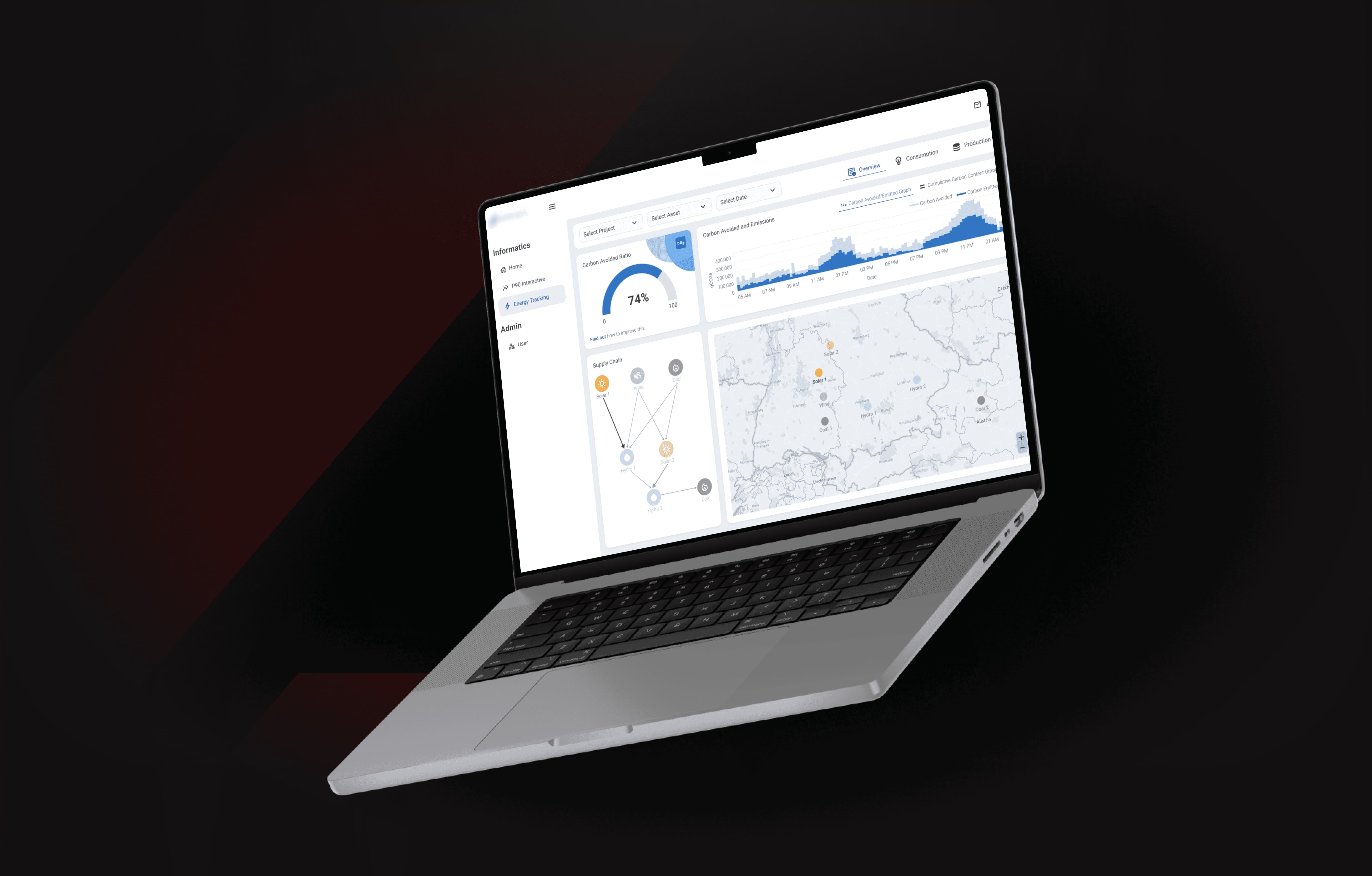
The result was a clearer and more credible carbon reporting experience.
The final dashboard gave the client a real-time way to present high-frequency carbon footprint insights with clarity and confidence. Business and science teams could operate from one shared data source, reducing confusion and improving communication around emissions trends.
By combining accurate climate modeling, live API infrastructure, and investor-ready product design, the platform helped the startup strengthen its credibility, accelerate reporting cycles, and present its technology as a serious innovation in carbon measurement.
The value of the dashboard was not only in showing emissions data in real time, but in making complex carbon intelligence easier to trust, explain, and act on.
More works.
" height="14.222232076856812px" id="MVwvIWkaW" transform="translate(21.333 28.444)" width="21.333339903089836px"/><path d="M 1.422 7.111 C 0.637 7.111 0 6.474 0 5.689 L 0 1.422 C 0 0.637 0.637 0 1.422 0 L 5.689 0 C 6.474 0 7.111 0.637 7.111 1.422 L 7.111 5.689 C 7.111 6.474 6.474 7.111 5.689 7.111 Z" fill="rgb(217, 45, 138)" height="7.111111111111086px" id="ySDQzQwB8" transform="translate(28.444 28.444)" width="7.111111111111313px"/><path d="M 32 17.778 L 32 19.911 C 32 20.696 31.363 21.333 30.578 21.333 L 26.311 21.333 C 25.526 21.333 24.889 20.696 24.889 19.911 L 24.889 17.778 Z M 17.778 24.889 L 10.667 24.889 L 10.667 19.2 C 10.667 18.415 11.304 17.778 12.089 17.778 L 17.778 17.778 Z M 17.778 32 L 17.778 39.111 L 12.089 39.111 C 11.304 39.111 10.667 38.474 10.667 37.689 L 10.667 32 Z M 32 10.667 L 24.889 10.667 L 24.889 1.422 C 24.889 0.637 25.526 0 26.311 0 L 30.578 0 C 31.363 0 32 0.637 32 1.422 Z M 24.889 17.778 L 17.778 17.778 L 17.778 12.089 C 17.778 11.304 18.415 10.667 19.2 10.667 L 24.889 10.667 Z M 24.889 46.222 L 32 46.222 L 32 55.467 C 32 56.252 31.363 56.889 30.578 56.889 L 26.311 56.889 C 25.526 56.889 24.889 56.252 24.889 55.467 Z M 32 17.778 L 32 10.667 L 37.689 10.667 C 38.474 10.667 39.111 11.304 39.111 12.089 L 39.111 17.778 Z M 32 39.111 L 39.111 39.111 L 39.111 44.8 C 39.111 45.585 38.474 46.222 37.689 46.222 L 32 46.222 Z M 56.889 26.311 L 56.889 30.578 C 56.889 31.363 56.252 32 55.467 32 L 46.222 32 L 46.222 24.889 L 55.467 24.889 C 56.252 24.889 56.889 25.526 56.889 26.311 Z M 24.889 39.111 L 24.889 46.222 L 19.2 46.222 C 18.415 46.222 17.778 45.585 17.778 44.8 L 17.778 39.111 Z M 10.667 24.889 L 10.667 32 L 1.422 32 C 0.637 32 0 31.363 0 30.578 L 0 26.311 C 0 25.526 0.637 24.889 1.422 24.889 Z M 39.111 32 L 46.222 32 L 46.222 37.689 C 46.222 38.474 45.585 39.111 44.8 39.111 L 39.111 39.111 Z M 39.111 24.889 L 39.111 17.778 L 44.8 17.778 C 45.585 17.778 46.222 18.415 46.222 19.2 L 46.222 24.889 Z" fill="rgb(217, 45, 138)" height="56.88889185587561px" id="rd1TZRx6X" transform="translate(3.556 3.556)" width="56.8888918558755px"/></g></svg>)
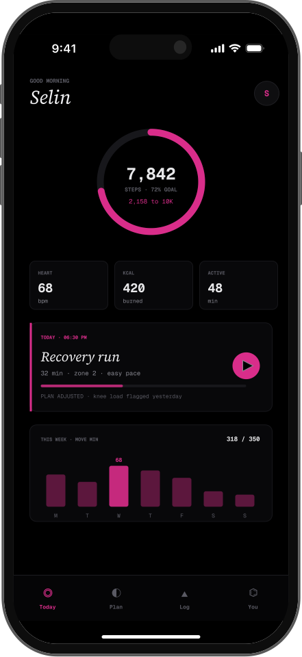
FitTrack – Fitness & Wellness Mobile App
This app helps users build better habits with Google Fit integration and real-time syncing.

Briefio AI
AI Academic Research Platform
A mobile-first academic research platform that turns dense research papers into concise summaries and audio-based insights for easier learning on the go.
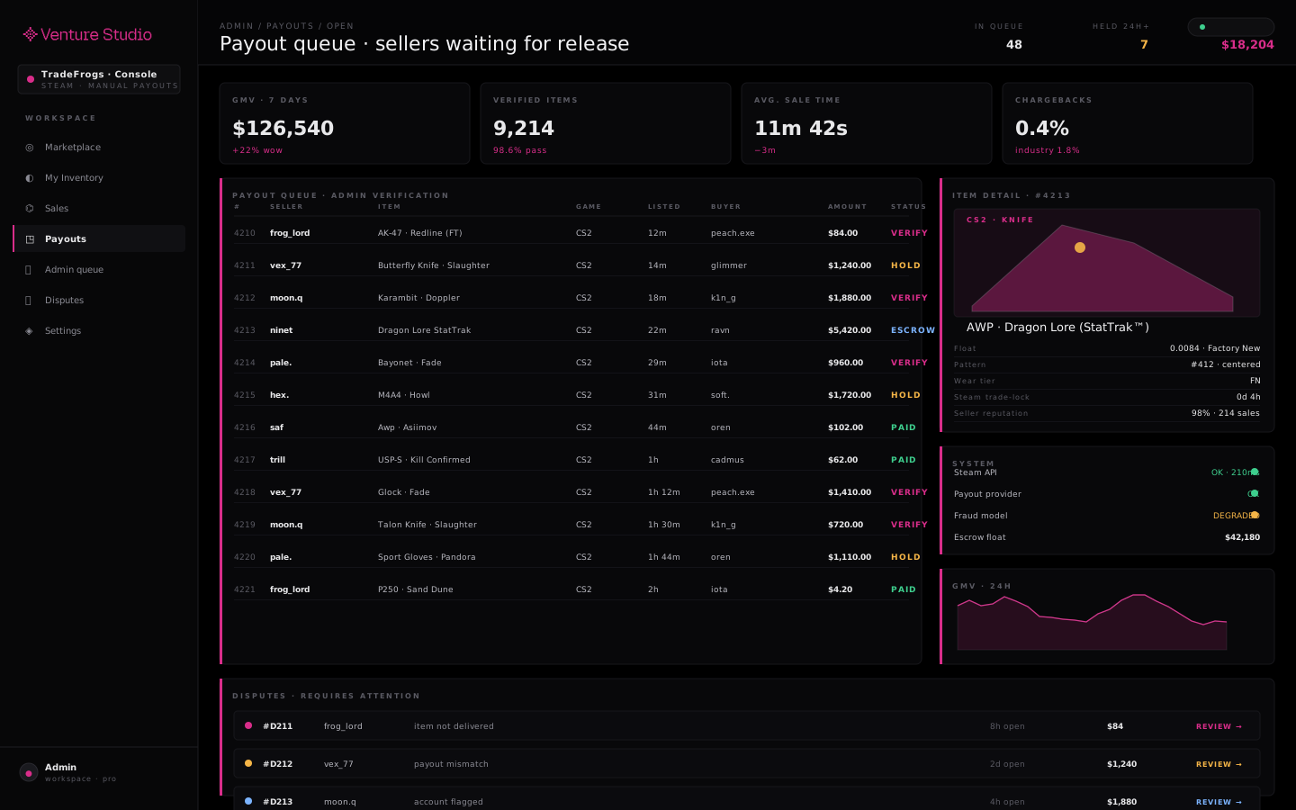
TradeFrogs - Gaming Marketplace Platform
Gaming Marketplace
TradeFrogs is a Steam-integrated marketplace for buying, selling, and cashing out in-game items. The MVP delivers secure, manually verified transactions, an admin-controlled workflow, and a scalable foundation.