
Merve Nur Yalçın Uslu
5 Min Read
Learn 5 essential data visualization techniques that make interpreting complex information easier for beginners in 2023.

Introduction
Data visualization is the practice of illustrating information using visuals like charts, graphs, infographics, and animations. These visually engaging representations simplify conveying complex data connections and insights in an easily understandable way. In today’s article, we compiled the top five must-know data visualization techniques for every beginner should have known. Let’s dive in without wasting any time!
Contents
About Data Visualization
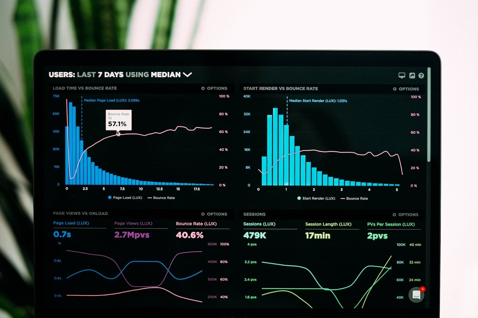
Line Charts
Line Charts
Area Charts
Bar Charts
Column Charts
Scatter Plots
Let’s dive in!
About Data Visualization
Data visualization is about translating data into visual formats, like charts, graphs, maps, and other graphical tools, aiming to simplify complex information. Its main objective is to convey data patterns, trends, and insights in a compelling, intuitive way, enabling easier understanding compared to raw data or text. It's crucial to recognize that data visualization encompasses more than just aesthetically pleasing charts. It spans from analyzing data to designing visuals and crafting narratives. Once regarded as a secondary aspect within data science, data visualization has now evolved into a dynamic and rapidly advancing domain. It's now enriched with a plethora of techniques, tools, theories, and insights from diverse fields such as psychology and neuroscience. Let’s take a look at the most important techniques for data visualization together.
Line Charts
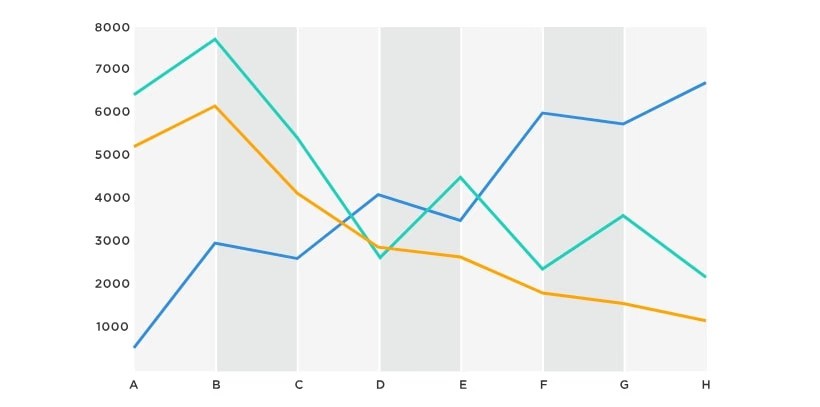
Line charts and area charts are common techniques for showing data trends and patterns across categories or time. While they're alike, each has unique uses. Line charts mainly display the relationship between two continuous variables, usually one on the horizontal x-axis and the other on the vertical y-axis. They show trends and sequences of data points with straight lines, making it clear how values change. Line charts work well for time-based data like stock prices or temperature changes, making it easy to compare different datasets on one graph and spot trends across various information sets.
Area Charts
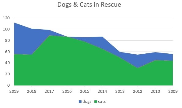
Area charts, like line charts, are great for showing trends over time or across categories. They stand out by filling the space between the line and the x-axis with color or patterns, showing how big the data is. This helps understand total amounts or proportions in the data. Area charts are especially good at showing how data is divided among different variables, focusing on size or proportions. They're handy for stacked data like market shares or income distribution over time, revealing how values compare between the line and the x-axis. In short, while line charts are best for trends, area charts excel at showing total or relative values, and the choice between them depends on specific data and the audience's needs.
Bar Charts

A bar chart arranges data based on the values across various categories, employing rectangles whose sizes correspond to each category's value. Widely used due to their simplicity, bar charts are frequently utilized in business contexts for comparisons, such as assessing the market share among diverse brands or evaluating revenue across different regions. Within this chart type, variations exist, each tailored for specific purposes.
Column Charts
Column charts, also called vertical bar charts, use upright rectangular columns to display data. Each column represents a specific category, and its height or length shows that category's value or frequency. They're great for comparing values or frequencies across different categories, especially when category labels fit neatly along the x-axis. These charts are handy for visualizing data like sales figures by month across regions, comparing test scores for different subjects, or showing market shares among companies. Both bar charts and column charts present categorical data and compare values among categories. Choosing between them depends on the data's layout and making sure the category labels are easy to read.
Scatter Plots
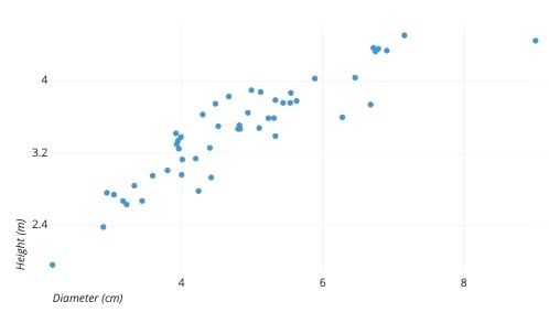
One of the most common techniques used. Scatter plots are employed to display the connection between two variables and assess potential correlations between them. Unlike more straightforward visualizations, they may require a moment for an unprepared reader to comprehend due to their less intuitive nature.
Above we have tried to explain the 5 most important techniques that you need to know as a beginner in data visualization. Of course, data visualization does not end with these 5 techniques. There are also data visualization services that you can use. If you would like to learn more about these services and services, you can visit VIZIO.AI and remove all the question marks in your mind.
If you like this article, you can check out our other articles.


