
Merve Nur Yalçın Uslu
9 Min Read
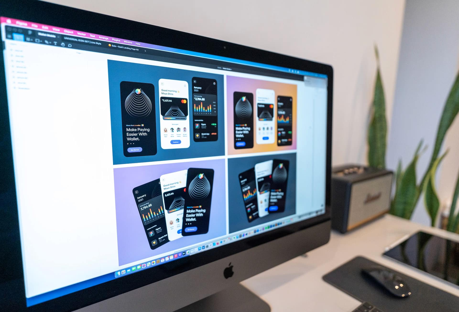
Let's learn more about the significance of UI/UX design in data visualization!

Introduction

As businesses become increasingly data-driven, effectively visualizing and analyzing data is more critical than ever. That’s where dashboards come in to provide a clear, concise way to understand complex data and make informed decisions.
In this blog post, we’ll explore:
The key benefits of our revolutionary dashboard design services,
Customization,
User-centric approach,
Scalability,
Integration.
Still choosing the BI stack behind those visuals? Our BI tools deep dive shows exactly where Power BI and Tableau shine for designers.
Whether you’re just getting started with boards or looking to improve an existing board from a design point of view, this post will give you the insights you need to be successful!
Let’s dive in!
Data with Intuitive Visualization and User-Friendly UI/UX Design
Data visualization is a critical aspect of UI/UX design in dashboard design services. Data visualization is the process of displaying data in a graphical or artistic style to help consumers comprehend complex data at a glance. Designers use a range of visualization techniques, such as charts, graphs, and tables, to present data in a meaningful and actionable way. A successful visualization of data may help users understand complicated data sets quickly and simply, allowing them to make educated decisions and take effective action. For example, a line graph can show trends over time, while a bar chart can compare different categories of data. However, selecting the appropriate chart type is not sufficient.
The way data is displayed has a big impact on how consumers perceive and comprehend it. Businesses may remain ahead of the competition, attain growth, and make more informed decisions based on data-driven insights by embracing the perks of dashboard design services. If we move on from here to UI/UX design and explain the relationship between them, UI/UX design is a critical aspect of dashboard design services. It is vital that the dashboard be both aesthetically pleasing and simple to use
Each type of visualization has its strengths and limitations, and designers must choose the most appropriate visualization method based on the data being presented and the user’s needs.
Selecting the correct type of visualization, designers must also consider factors such as colour, layout, and labelling to ensure that the data is presented clearly and effectively. Colour can highlight essential data or create a visual hierarchy that guides the user’s attention. Layout and labelling can help users quickly understand the key insights and trends in the data. Another important consideration in data visualization is interactivity. Interactive features such as hover-over tooltips, clickable elements, and animation can make the dashboard more engaging and enable users to explore the data in greater detail.
Customized Design and UI/UX Design in Dashboard Design
Customization is one of the essential benefits of dashboard design services. Every business has unique data needs, and a well-designed dashboard should be tailored to meet those needs. It enables businesses to create a dashboard tailored to their special data needs. However, customization is more than just a matter of selecting suitable data sources and visualization techniques.
A well-designed dashboard should be intuitive and easy to use, even as it incorporates many data sources and visualization techniques. It requires a thoughtful approach to UI/UX design that prioritizes simplicity, clarity, and ease of use. Designers must carefully consider the dashboard layout, organizing the data in a way that makes sense to users and presents a clear picture of the business’s performance. They must also ensure the dashboard is visually appealing, using colour, typography, and other design elements to create a cohesive and engaging interface.
Paying close attention to the interactions between different data sources ensures that the dashboard provides users a smooth and intuitive experience when navigating other applications and tools. It may include designing custom interactions and workflows tailored to the specific data sources and visualization techniques used in the dashboard.
Customization and UI/UX design are vital to successful dashboard design services. By creating a dashboard tailored to the business’s unique data needs and designed with the user in mind, businesses can make more informed decisions faster and with greater confidence.
User-Centric Approach and UI/UX Design in Dashboard Design
A user-centric approach is a critical benefit of dashboard design services, enabling businesses to create a dashboard that is not only visually appealing but also easy to use and understand. However, a user-centric approach is not just gathering end-user feedback; it also has important implications for UI/UX design.
One of the most important aspects of a user-centric approach is gathering feedback from the end-users of the dashboard. Dashboard designers work closely with users to understand their needs and pain points and ensure the dashboard meets their requirements. This feedback loop is an integral part of the design process, as it helps to refine the dashboard until it is easy to use and understand. A well-designed dashboard for a sales team might include charts and graphs that show performance metrics, such as revenue and pipeline, in real-time.
The dashboard allows users to filter data by date range, region, or product line to get a more detailed view of their performance. Another critical aspect of a user-centric approach is designing the dashboard to match the user’s workflow.
The dashboard should be prepared to effortlessly be aligned with the CRM system the sales team utilizes. Moreover, a user-centric approach ensures that the dashboard is visually appealing and easy to use and understand. By gathering end-user feedback and designing the dashboard to match their workflow, dashboard design services can help businesses get the most out of their data and make more informed decisions.
Scalability and UI/UX Design in Dashboard Design
As your firm expands and changes, your data demands will probably alter as well. That’s why scalability is another key benefit of dashboard design services. Scalability enables businesses to quickly and easily adjust their data strategy to keep up with changing market conditions. A well-designed dashboard can adapt to your changing data needs without disrupting the overall design or functionality of the dashboard.
However, scalability is more than simply a technical challenge; it also has important UI/UX design consequences. A designed effectively dashboard should be scalable to accommodate your evolving data demands without compromising the dashboard’s overall aesthetic or performance. Proper UI/UX design is necessary, with an emphasis on flexibility, clarity, and utility. To easily accommodate changes to your data strategy, your dashboard should be designed with flexibility. When you need to add new data sources or change the way your data is organized, your dashboard should be able to handle these changes without any obvious reconfiguration or redesign.
As businesses grow and evolve, their data needs will likely change, and an aesthetically pleasing dashboard should be able to accommodate those changes seamlessly.
Integration and UI/UX Design in Dashboard Design

Seamless integration is a key benefit of dashboard design services, enabling businesses to combine their data sources into a single, unified platform. However, integration is not just a technical challenge but has important UI/UX design implications. Integration requires careful attention to the user experience.
It necessitates an organized approach to UI/UX design that promotes simplicity, information, and usability. Designers must pay particular attention to how different sources of data interact with one another, ensuring that the dashboard offers visitors with a fluid and instinctive interface as they navigate other programs and tools. It may involve integrating different types of data visualization, such as charts, graphs, and maps, to help users make sense of complex data sets.
Dashboard design services rely heavily on integration and UI/UX design. By merging data from several sources in a simple and user-friendly manner, businesses can make better-informed choices more quickly and confidently. By integrating the dashboard with existing systems, businesses can save time and avoid the need to switch between different applications or tools.
Information Architecture and UI/UX Design in Dashboard Design

Information architecture and UI/UX design are critical components of successful dashboard design services. Information architecture is the process of organizing data in a clear, logical, and intuitive way. At the same time. Adequate information architecture is necessary when creating a dashboard that is simple to explore and comprehend. By organizing data in a way that makes sense to users, businesses can ensure that the dashboard provides quick access to the information users need to make informed decisions. For example, designers may group data by category, present data in a hierarchical structure or use visual cues like icons to help users quickly identify the needed data. They may also use colour, typography, and other design elements to create a cohesive and engaging interface that is easy to use and understand.
Effective information architecture and UI/UX design are critical to successful dashboard design services. By organizing data in a way that makes sense to users and creating visually appealing structures, businesses can make more informed decisions faster and with greater confidence.
Accessibility and UI/UX Design in Dashboard Design
Accessibility is an aspect of UI/UX design in dashboard design services, ensuring that all users can use the dashboard regardless of their physical abilities. Adequate accessibility requires a thoughtful approach to UI/UX design that prioritizes inclusivity and ease of use for all users. Designers must ensure the dashboard can be navigated using a keyboard, making it accessible to users who cannot use a mouse or other pointing device. They must also use high-contrast colours to make the dashboard easier to read for users with visual impairments.
Designers may also include alternate language for images to ensure that people with visual impairments comprehend the information displayed on the dashboard. They may also leverage additional accessibility features, such as screen reader compatibility, to guarantee that users with hearing impairments can navigate the dashboard.
Practical accessibility and UI/UX design are critical components of successful dashboard design services. By designing a dashboard accessible to all users, businesses can ensure everyone can access the information they need to make informed decisions.
Usability Testing and UI/UX Design in Dashboard Design
Designers may conduct usability testing to identify areas of the dashboard that could be clearer. They may ask end-users to perform specific tasks, such as finding data points or navigating through the dashboard, to identify improvement areas.
Usability testing can help designers refine the dashboard design and improve the user experience, creating a more intuitive dashboard. Businesses may guarantee that the dashboard fulfils the needs of their users and delivers the information they need to make educated choices by including input from users in the design phase.
Overall, effective usability testing and UI/UX design are critical components of successful dashboard design services. By testing the dashboard with end-users and incorporating their feedback into the design process, Businesses can develop a dashboard that is simple to grasp, quicker, and more confident, allowing them to make better-informed decisions.
Conclusion
Let's learn more about the significance of UI/UX design in data visualization!


